Substation Focused on Environmental Design
By www.inmr.com
By www.inmr.com

Our customized live online or in‑person group training can be delivered to your staff at your location.


Substation focused on environmental design integrates sustainable engineering, SF6-free switchgear, low-loss transformers, oil containment, noise mitigation, and lifecycle assessment to minimize footprint, reduce emissions, ensure regulatory compliance, and enable resilient, grid-connected renewable energy.
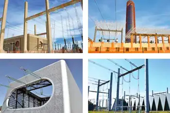
One of the important trends in design of new overhead lines over the past 20 years has been development of structures and designs that are less obtrusive and more pleasing visually. Much the same process has also been going on at substations. For example, even 25 years ago, efforts had already been in place as far afield as Finland and Australia to build substations designed to facilitate acceptance by affected communities – either through aesthetic appearance, reduced scale or other factors. Indeed, more and more substations these days – especially those sited in urban centers or along well-traveled roads – are being designed to minimize adverse environmental and aesthetic impact. For context on modern planning principles, see this overview of electrical substation design and how aesthetics are incorporated.
During the mid-1990s, TransGrid – the network operator in New South Wales (NSW), Australia – wanted to build a substation at the confluence of existing 330 kV and 132 kV lines. Located some 60 km west of Sydney, this pristine rural area is marked by hobby farms and historic towns – exactly the type of place where any proposed new air-insulated substation would likely be met with staunch resistance. But given the site’s high strategic value, engineers worked extra hard to find a design that would meet all criteria required for public acceptance, without resorting to costly GIS. Comparisons with a gas-insulated substation help illustrate the cost and footprint tradeoffs they were weighing.
Among the measures in this regard was to go out at an early stage to involve local people and all relevant special interest groups. Various options were laid out even before a firm site had been selected. One of these included establishing a wildlife area with animal paths integrated into the station’s overall landscaping. More significantly, one of the most evident differences at Regentsville Substation versus a ‘compact’ station in densely populated regions is that the key goal here was to minimize height, not land surface. Unlike in places such as Europe where compact station design typically involves a small ‘footprint’ with relatively tall structures, land size was not the central issue here. Instead, the focus was on controlling height to best understate the station’s visual impact. One obvious example of this philosophy is the 330 kV entrance portal, which is unusually low compared to other TransGrid substations at this voltage. The 132 kV portal is also lower than conventional. Generally, there is a trade-off in height, with lower structures requiring the first to be located fairly close to the station. But here this was not a factor since the tower was already there. Helping make the low green-colored portals even less noticeable was use of low profile composite insulators, also utilized on the tower entering the substation. Choices such as low-profile insulators and portal structures align with typical electrical substation components optimized for visual impact.
One of the basic rules at Regentsville was that any structure above a certain height was to be painted green. This included the double circuit tower immediately adjacent to the station. Similarly, incoming 330 kV towers were painted to better blend against a nearby hill. To make conductors less noticeable in sunlight, their sheen was taken out by grit blasting. Such ‘shadowline’ conductors have gone on to become the norm throughout NSW. In regard to approaching overhead lines, these were designed to have maintained trees beneath themas part of the normal easement maintenance. In fact, TransGrid stopped creating new line corridors by close cutting to bare earth. In addition, to keep tower height near the station at a minimum, peaks were eliminated. For readers less familiar with system layouts, this primer on what is an electrical substation provides useful background on line approaches and site considerations.
Like entrance portals, bus heights at Regentsville are also lower than normal and at different heights depending on maintenance requirements. For example, the two comparatively high buses reflect the need to bring equipment in underneath and, even so, more care than normal is exercised during maintenance. Regentsville is designed as a classical mesh substation where lines are at one corner and transformers are situated at opposite corners. The sole transformer (at time of visit by INMR in 1998) is enclosed in aerated concrete block that significantly reduces ambient noise. Moreover, there is a three-stage oil recovery system such that, apart from the transformer enclosure, there is a tank where separation of oil and water takes place. As such, any oil spill can be fully contained. In addition, reflecting that perfect separation never occurs in practice, any overflow goes directly into an adjacent duck pond where further outflow is from a dam at the bottom. This guarantees that any spill can be fully contained on site. Noise control and spill containment often go hand in hand with robust substation grounding practices that mitigate step and touch potentials.
In a mesh design, conductors have to cross each other in the substation and three comparatively high poles are utilized for this purpose. While comparatively obtrusive by their height, a cable connection to them makes them less visible than might otherwise be the case. Also, height has been minimized through use of composite insulators. Similarly, presence of many structures supporting earth wires over the station was reduced through a design that sees only a few strategically placed poles linked together in spider web fashion. Another design feature to minimize presence of tall structures that could be seen from a nearby road is use of an optical communications system in place of microwave tower. While more costly, this avoided having to use an especially high communications tower given that Regentsville is located in a valley. The adoption of optical links foreshadowed elements of a digital substation approach that reduces visual clutter and improves monitoring.
In terms of economics, the extra costs of such a low-environmental impact substation were partly offset by lower material costs. Moreover, the special residential-look buildings were not much more expensive. On the other hand, costs associated with landscaping were much higher than what would be considered normal in other situations. While much of what was accomplished at Regentsville Substation was not groundbreaking in itself and has been done elsewhere, it was the combination of all these ideas in one location that remains fairly unique. The substation subsequently won an engineering excellence award and was even used by local governments as a model of development carried out in co-operation with the affected community. Modern planning of similar projects often leverages 3D substation design utilizing AutoCAD to assess aesthetics and constructability early.

Doble Engineering Company is a global leader in diagnostic test equipment, software and engineering services for the electric power industry. Founded in 1920, it helps utilities and energy asset owners improve reliability, assess system health, and optimize operations through advanced diagnostics and expertise worldwide.
Contact us at sales@doble.com , or visit https://www.doble.com

Advantages To Instructor-Led Training – Instructor-Led Course, Customized Training, Multiple Locations, Economical, CEU Credits, Course Discounts.
Request For QuotationWhether you would prefer Live Online or In-Person instruction, our electrical training courses can be tailored to meet your company's specific requirements and delivered to your employees in one location or at various locations.